2. Describing Data with Tables and Graphs
Bar Graphs and Pareto Charts
Problem 2.2.40
Textbook Question
Extending Concepts
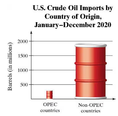
A Misleading Graph? A misleading graph is not drawn appropriately, which can misrepresent data and lead to false conclusions. In Exercises 37–40, (a) explain why the graph is misleading, and (b) redraw the graph so that it is not misleading.
 Verified step by step guidance
1
Analyze the graph: The graph compares U.S. crude oil imports from OPEC countries and non-OPEC countries using barrel icons. The size of the barrels is disproportionate to the actual data values, which can visually exaggerate the difference between the two categories.
Explain why the graph is misleading: The barrel icons are scaled in both height and width, making the visual difference appear much larger than the actual numerical difference. This violates the principle of proportional representation in graphs, as the area of the barrels does not correspond to the data values.
Redraw the graph: To make the graph accurate, use a standard bar graph where the height of the bars is proportional to the data values. Ensure that the y-axis is labeled clearly and scaled appropriately to represent the range of values.
Label the axes and provide context: Clearly label the x-axis with 'Country of Origin' and the y-axis with 'Barrels (in millions).' Include a title that accurately describes the data, such as 'U.S. Crude Oil Imports by Country of Origin, 2020.'
Verify proportionality: Ensure that the visual representation of the data (e.g., bar heights) matches the numerical values provided. This will prevent misinterpretation and allow viewers to draw accurate conclusions from the graph.
Verified video answer for a similar problem:This video solution was recommended by our tutors as helpful for the problem above
Video duration:
1mWas this helpful?

 4:52m
4:52mWatch next
Master Creating Bar Graphs and Pareto Charts with a bite sized video explanation from Patrick
Start learningRelated Videos
Related Practice