Table of contents
- 1. Intro to Stats and Collecting Data55m
- 2. Describing Data with Tables and Graphs1h 55m
- 3. Describing Data Numerically1h 45m
- 4. Probability2h 16m
- 5. Binomial Distribution & Discrete Random Variables2h 33m
- 6. Normal Distribution and Continuous Random Variables1h 38m
- 7. Sampling Distributions & Confidence Intervals: Mean1h 3m
- 8. Sampling Distributions & Confidence Intervals: Proportion1h 12m
- 9. Hypothesis Testing for One Sample1h 1m
- 10. Hypothesis Testing for Two Samples2h 8m
- 11. Correlation48m
- 12. Regression1h 4m
- 13. Chi-Square Tests & Goodness of Fit1h 20m
- 14. ANOVA1h 0m
2. Describing Data with Tables and Graphs
Bar Graphs and Pareto Charts
Problem 2.2.27
Textbook Question
Graphing Data Sets In Exercises 17–32, organize the data using the indicated type of graph. Describe any patterns.
Smartphone Sales The five best-selling smartphone manufacturers of 2020 were Apple (206.1 million units), Huawei (189.0 million units), Samsung (266.7 million units), vivo (111.7 million units), and Xiaomi (147.8 million units). Use a Pareto chart to display the data. (Source: International Data Corporation)
 Verified step by step guidance
1
Step 1: Understand the problem. A Pareto chart is a type of bar graph where the bars are arranged in descending order of frequency or magnitude. It is often used to highlight the most significant factors in a data set. Here, we are tasked with creating a Pareto chart for smartphone sales data.
Step 2: Organize the data. List the smartphone manufacturers and their corresponding sales figures in descending order of sales. The order should be: Samsung (266.7 million), Apple (206.1 million), Huawei (189.0 million), Xiaomi (147.8 million), and vivo (111.7 million).
Step 3: Calculate the cumulative percentage. For each manufacturer, calculate the cumulative percentage of total sales. First, find the total sales by summing all the sales figures: Total Sales = 266.7 + 206.1 + 189.0 + 147.8 + 111.7. Then, for each manufacturer, divide their sales by the total sales and multiply by 100 to get the percentage. Add these percentages cumulatively as you move down the list.
Step 4: Create the Pareto chart. On the x-axis, list the manufacturers in descending order of sales. On the left y-axis, plot the sales figures as bars. On the right y-axis, plot the cumulative percentage as a line graph. Ensure the bars and the cumulative percentage line are clearly labeled.
Step 5: Analyze the chart. Look for patterns in the data. For example, identify which manufacturers contribute the most to total sales and whether a small number of manufacturers dominate the market. This analysis can help in understanding the distribution of sales among the top manufacturers.
 Verified video answer for a similar problem:
This video solution was recommended by our tutors as helpful for the problem above
Video duration:
3mPlay a video:
Was this helpful?
Key Concepts
Here are the essential concepts you must grasp in order to answer the question correctly.
Pareto Chart
A Pareto chart is a type of bar graph that represents the frequency or impact of problems in a descending order. It is based on the Pareto principle, which states that roughly 80% of effects come from 20% of causes. In the context of smartphone sales, a Pareto chart can visually highlight which manufacturers dominate the market, allowing for quick identification of the most significant contributors to total sales.
Recommended video:

Creating Bar Graphs and Pareto Charts
Data Organization
Data organization involves structuring data in a way that makes it easier to analyze and interpret. This can include sorting data, categorizing it, or using specific types of graphs to represent it visually. For the smartphone sales data, organizing the figures into a Pareto chart helps to clearly illustrate the relative sales volumes of each manufacturer, facilitating pattern recognition and comparison.
Recommended video:
Guided course

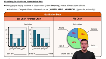
Visualizing Qualitative vs. Quantitative Data
Pattern Recognition
Pattern recognition in data analysis refers to the ability to identify trends, correlations, or anomalies within a dataset. By examining the Pareto chart of smartphone sales, one can observe which manufacturers are leading in sales and how they compare to others. Recognizing these patterns is crucial for making informed business decisions and understanding market dynamics.
Recommended video:
Guided course

Residuals and Residual Plots

 4:52m
4:52mWatch next
Master Creating Bar Graphs and Pareto Charts with a bite sized video explanation from Patrick
Start learningRelated Videos
Related Practice


